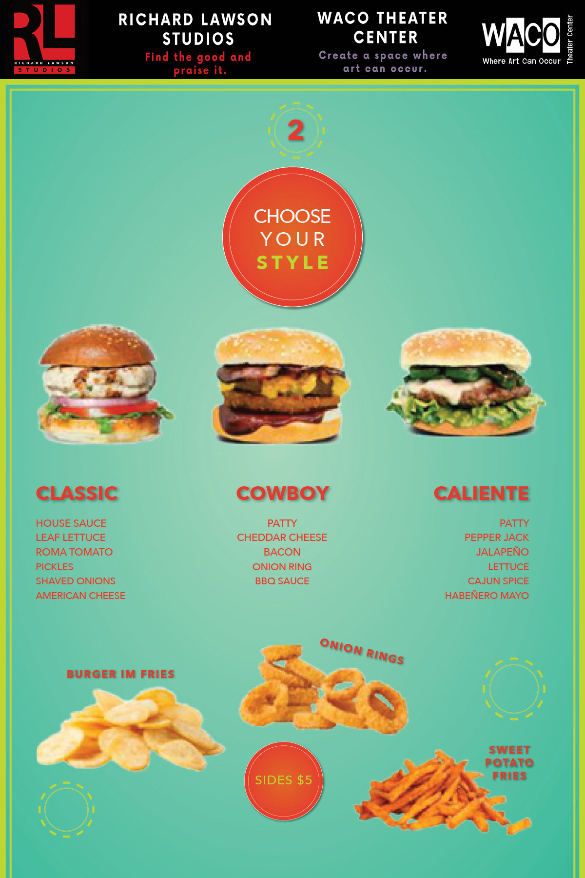
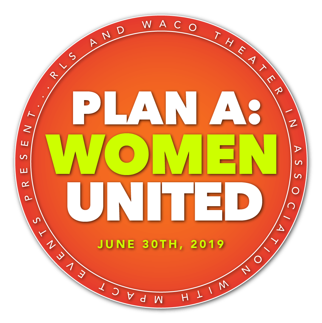
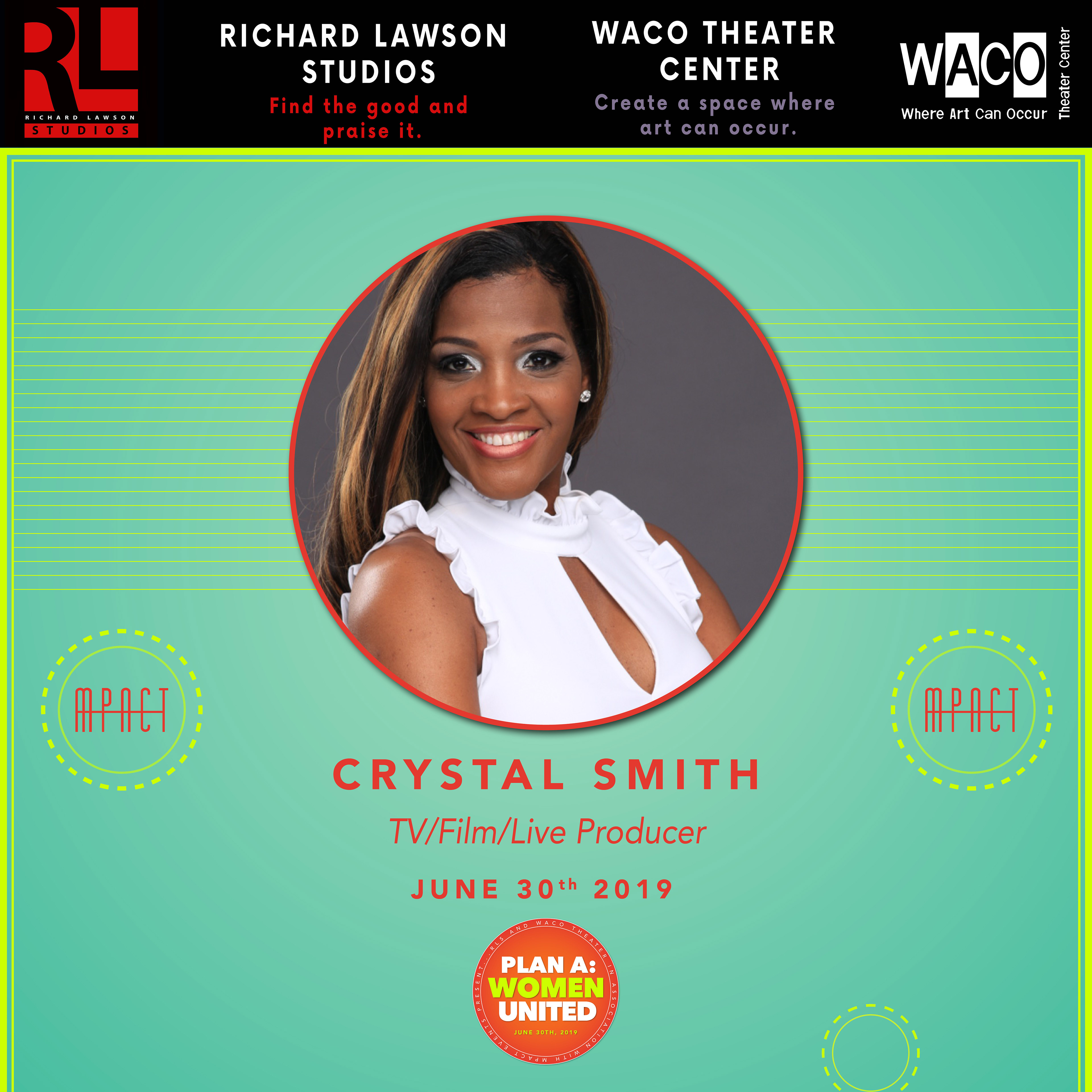
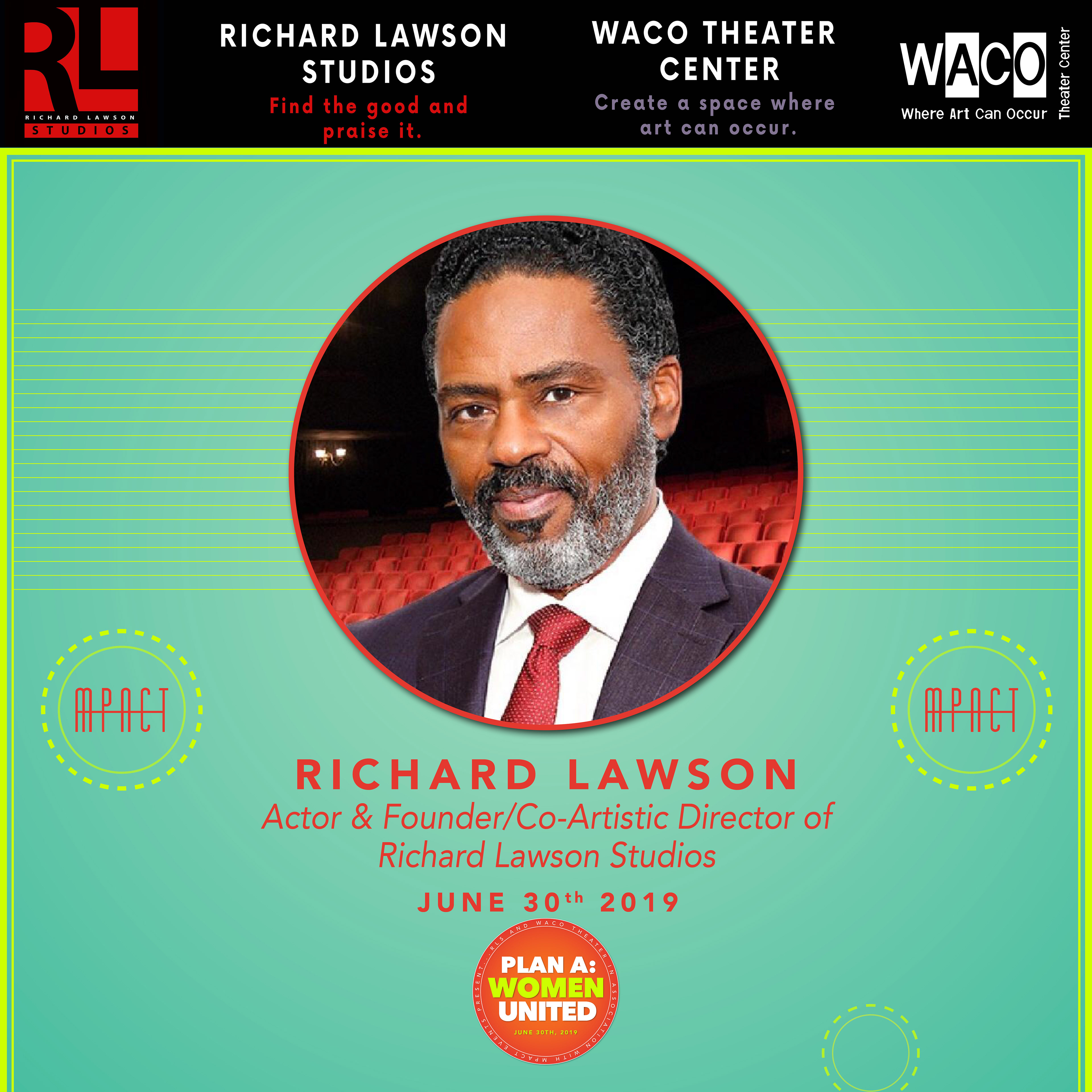
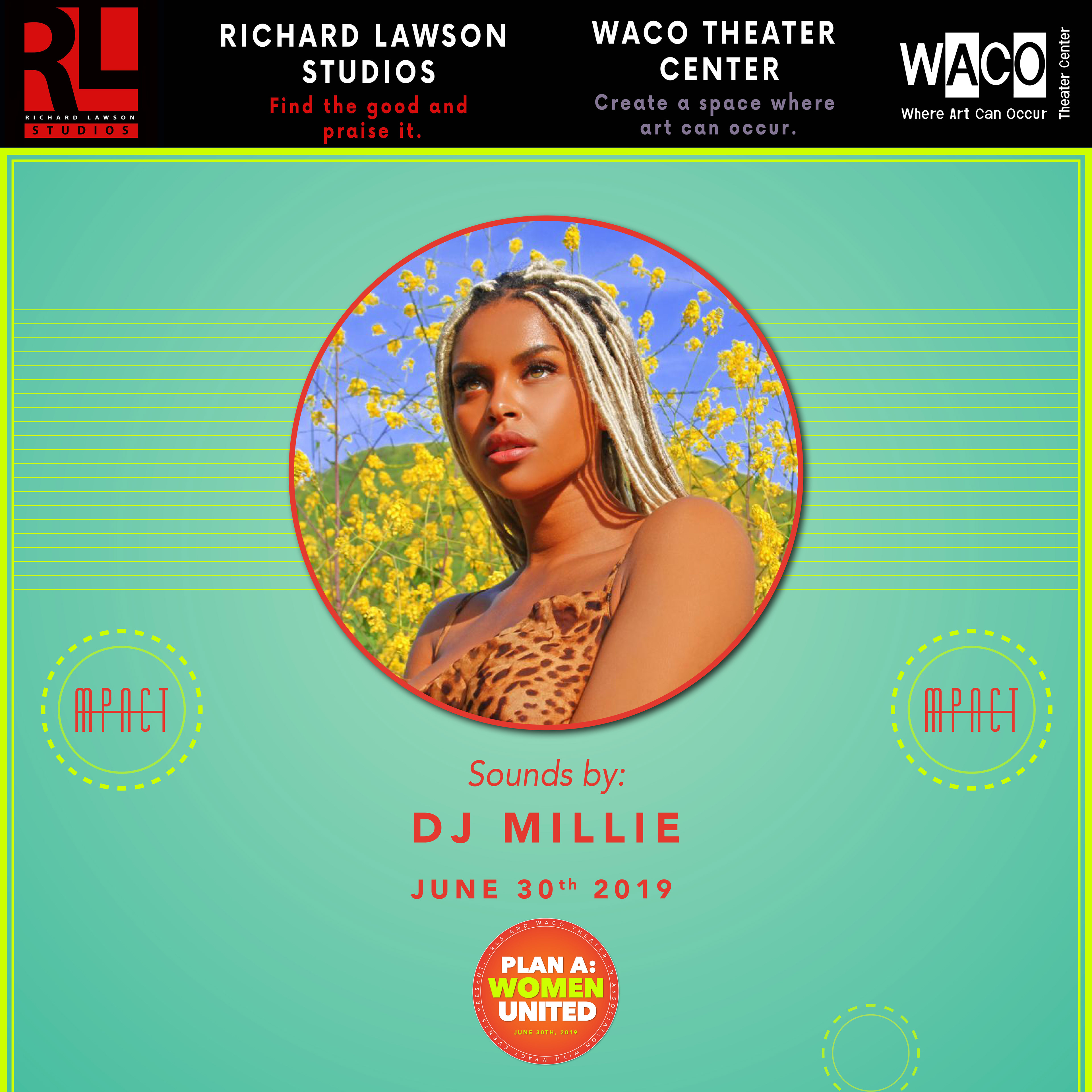
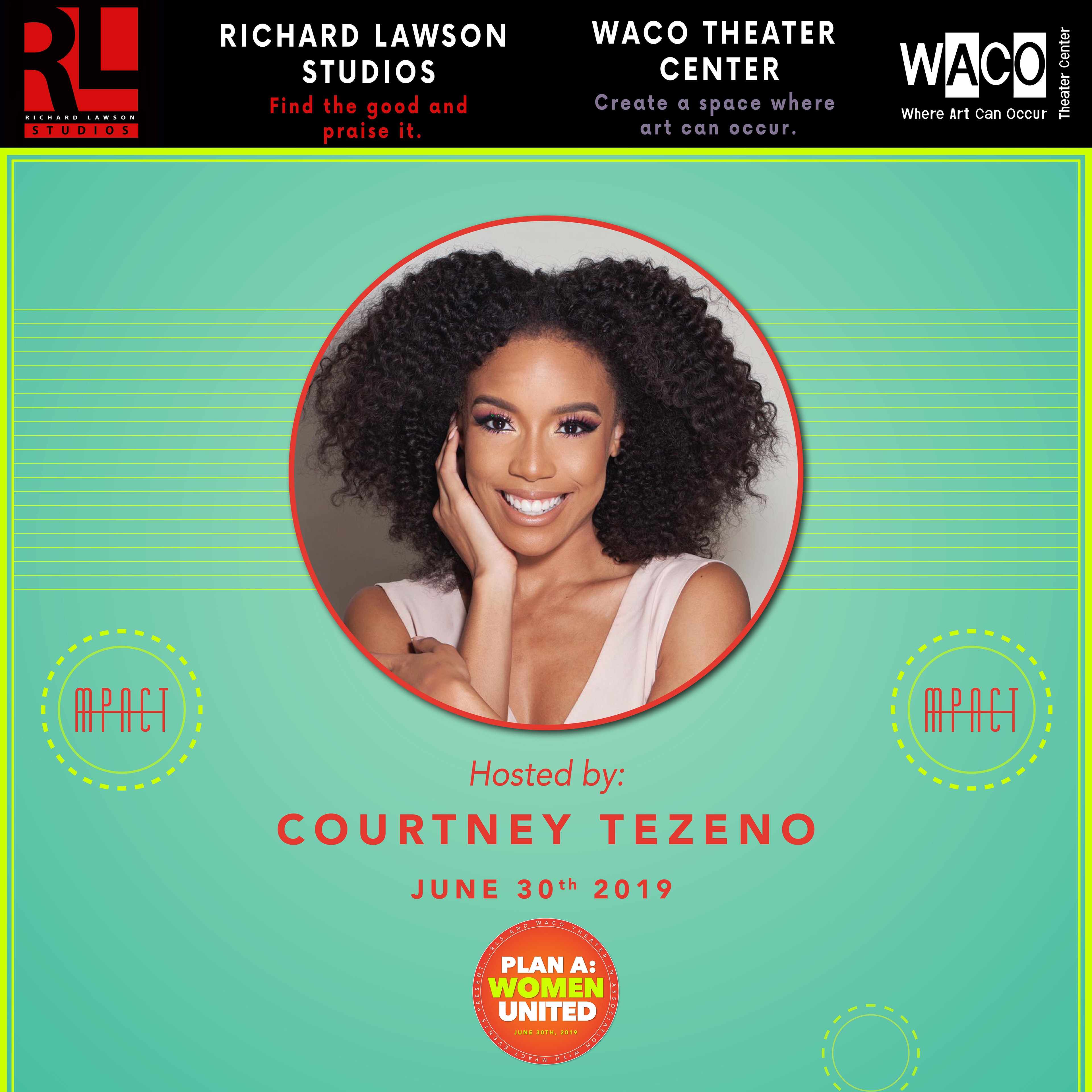
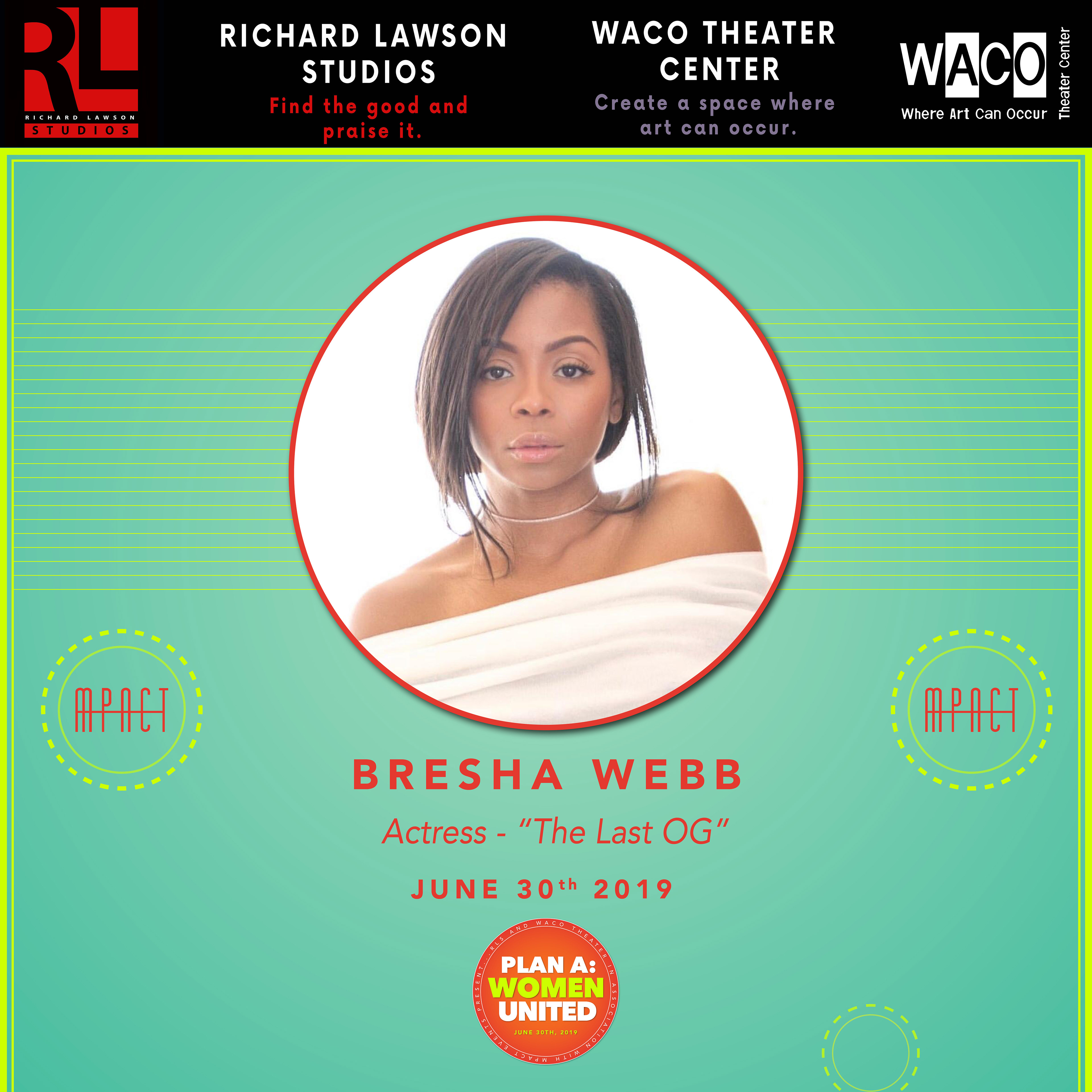
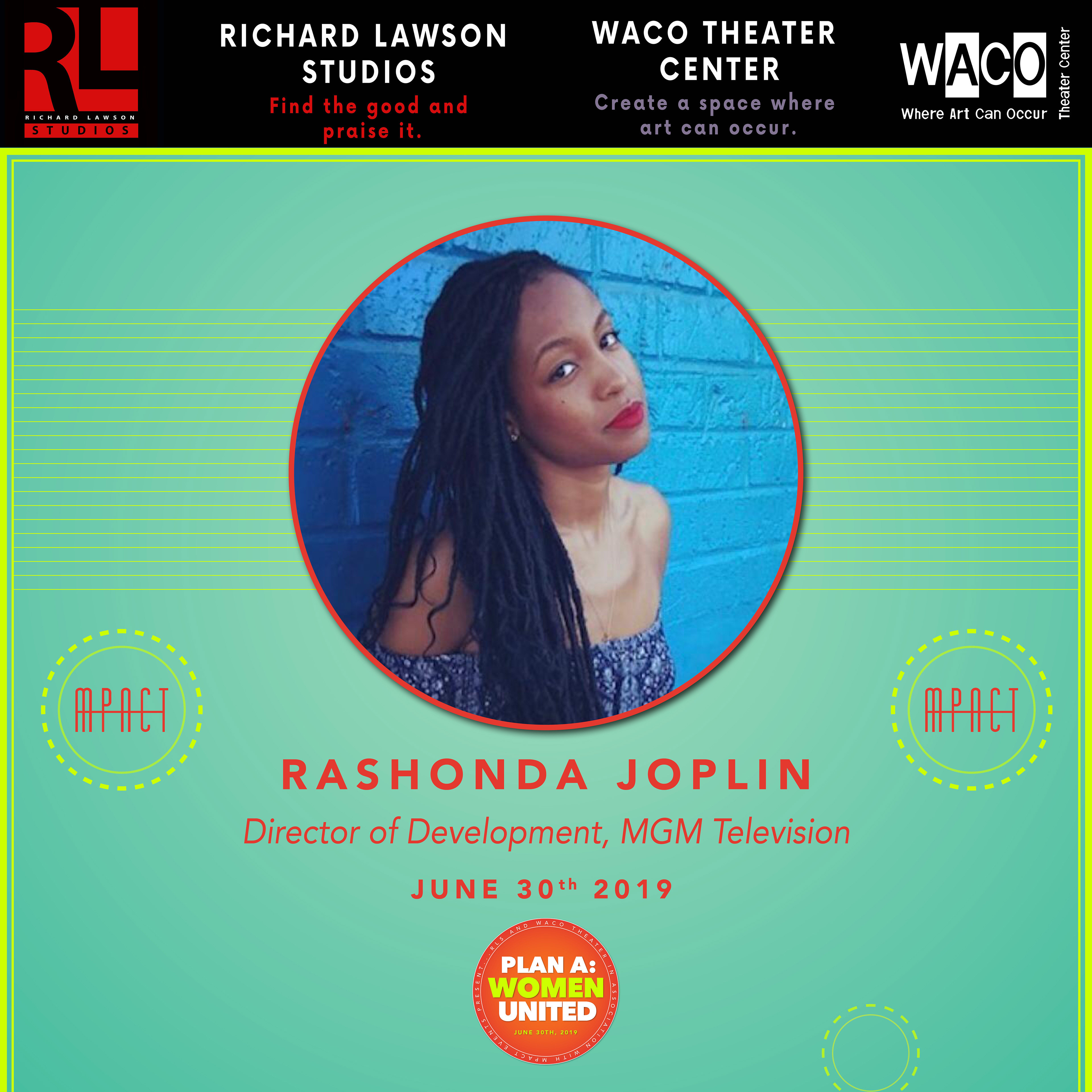
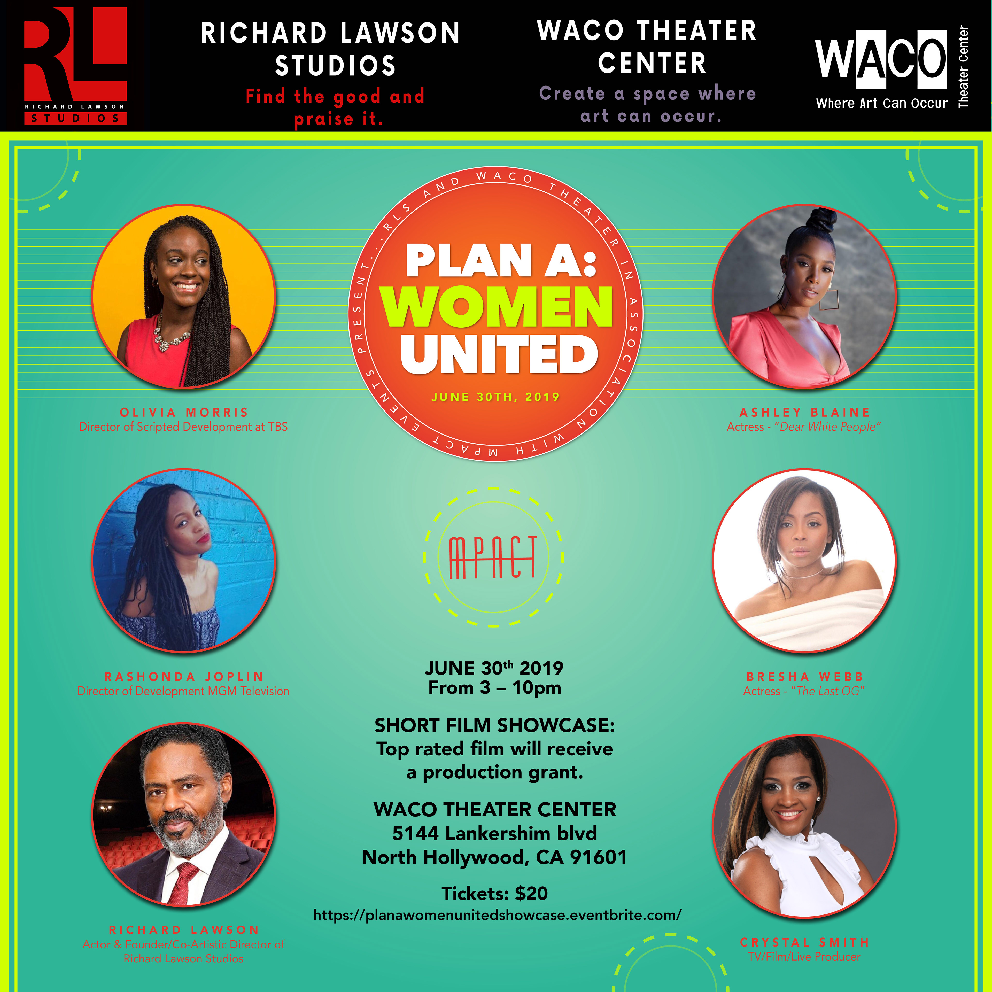
Plan A: Women United was an event created by MPACT Events dedicated to showcasing women in film. Thanks to the success of Women Empowered MPACT gained sponsorship through Winc wines, Story Data, MVMT watches, Qyera Parks of Cinta, and catering through Burger IM. This time around MPACT wanted the campaign to include individual social media posts for the panelists. Before there were only advertisements for all panelists on one post. This time MPACT wanted to give each panelist their own flyer for social media and a menu for Burger IM “summer/neon colors.”

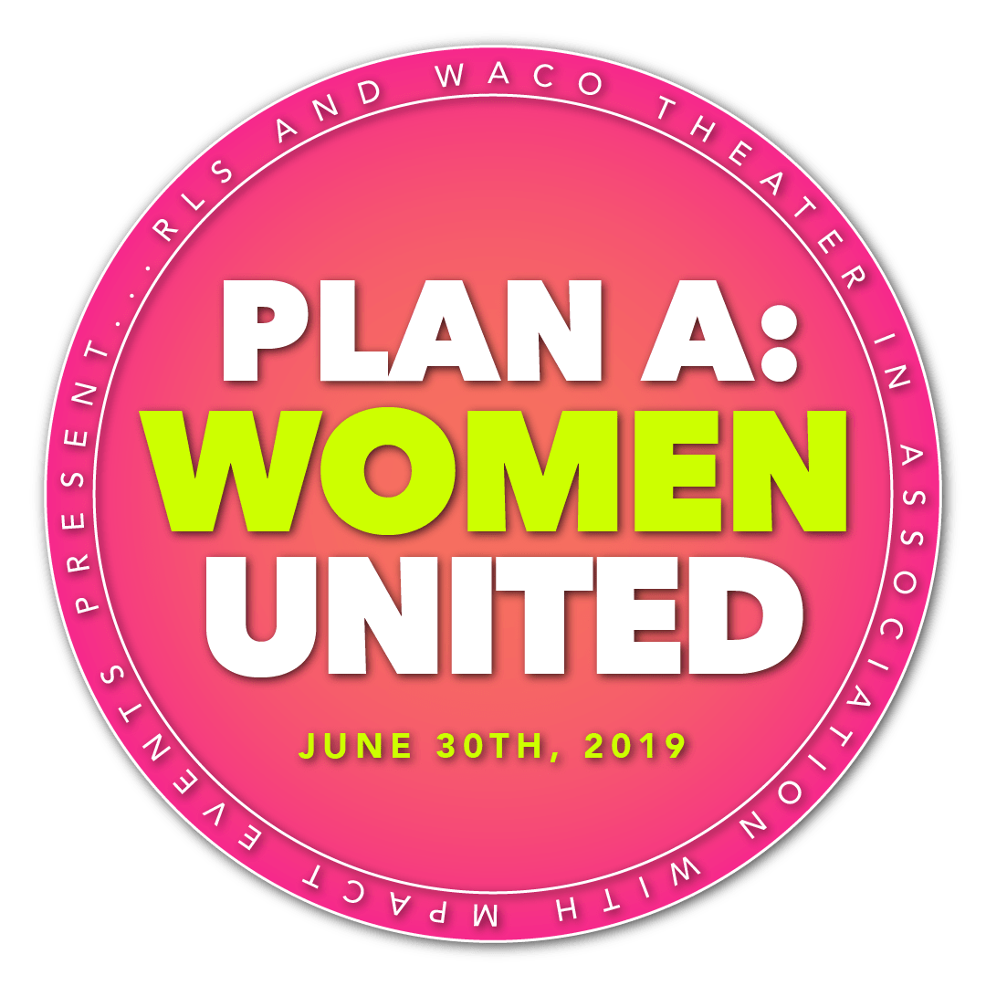

Using colors typically found in designs that present a summer aesthetic (bright, primaries), I altered a few colors to incorporate the neon aspect. I used circles to represent something fun, adding drop shadows and colored borders.
The title graphic, “Women United,” gave me the idea to create a design using the word “United” thinking of the USA. I went with a slim font for the title, giving the design a congressional look while still maintaining the feminine, bright, summer aesthetic. I wanted to take all the information and put it onto the circle, sponsoring and creating the event, the date, etc. Including dotted outline neon yellow design elements outside of the ellipse; something fun.
The title graphic, “Women United,” gave me the idea to create a design using the word “United” thinking of the USA. I went with a slim font for the title, giving the design a congressional look while still maintaining the feminine, bright, summer aesthetic. I wanted to take all the information and put it onto the circle, sponsoring and creating the event, the date, etc. Including dotted outline neon yellow design elements outside of the ellipse; something fun.


Summer is bright, colorful, hot in your face. And neon is bright only at night. So how can one combine both a day and night to make one cohesive campaign? And what about the title graphic? How should that look?
In addition to the social media ads, MPACT requested a menu since Burger IM was catering food. I took the same design as the panelist flyers and applied it to the menu in both print and digital formats.